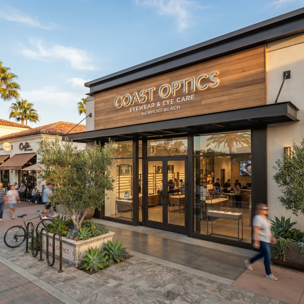
Every day, people walk or drive past hundreds of signs — but only a handful actually register in their minds. Why do some signs stop people in their tracks while others go completely unnoticed? The answer lies in psychology. A well-designed custom sign isn't just a nameplate on a building; it's a carefully engineered tool that taps into how the human brain processes color, shape, contrast, and language. At Sign Design, we combine creative design with these psychological principles to build signage that actually converts foot traffic into customers.
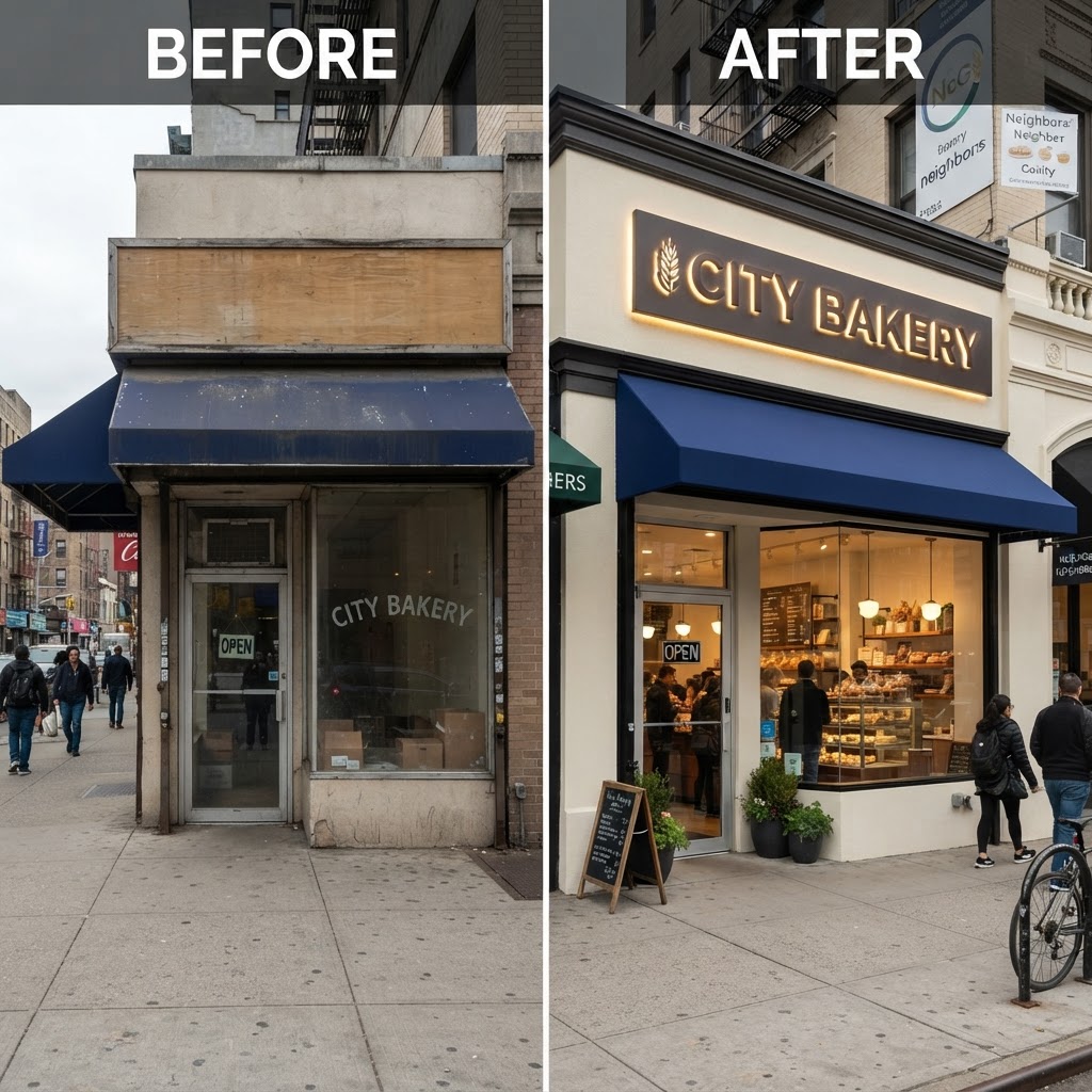
Color Psychology: The First Impression Happens in Milliseconds
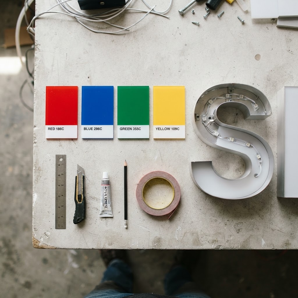
Studies in consumer psychology consistently show that people form a judgment about a brand within 90 seconds of first exposure, and up to 90% of that judgment is based on color alone. Different colors trigger different emotional responses:
- Red creates urgency and excitement — great for sales, restaurants, and clearance signage.
- Blue builds trust and calm — common in healthcare, financial, and professional services signage.
- Green signals growth, health, and sustainability — popular with wellness and eco-conscious brands.
- Yellow grabs attention quickly and is often used for high-visibility warning or directional signs.
Choosing the right color palette for a custom sign isn't about personal preference — it's about aligning the emotional response with what the business wants a customer to feel the moment they see it.
Typography and Legibility: Speed Matters
The average person only has a few seconds to read a sign while walking or driving by. Psychologically, our brains process simple, bold, high-contrast shapes far faster than intricate or overly stylized fonts. This is why effective custom signage relies on:
- Strong contrast between text and background
- Letter spacing that remains legible from a distance
- Fonts that reflect brand personality without sacrificing readability
A beautifully designed logo that can't be read from across the parking lot fails at its most basic job — communication.
The Power of Dimension and Texture
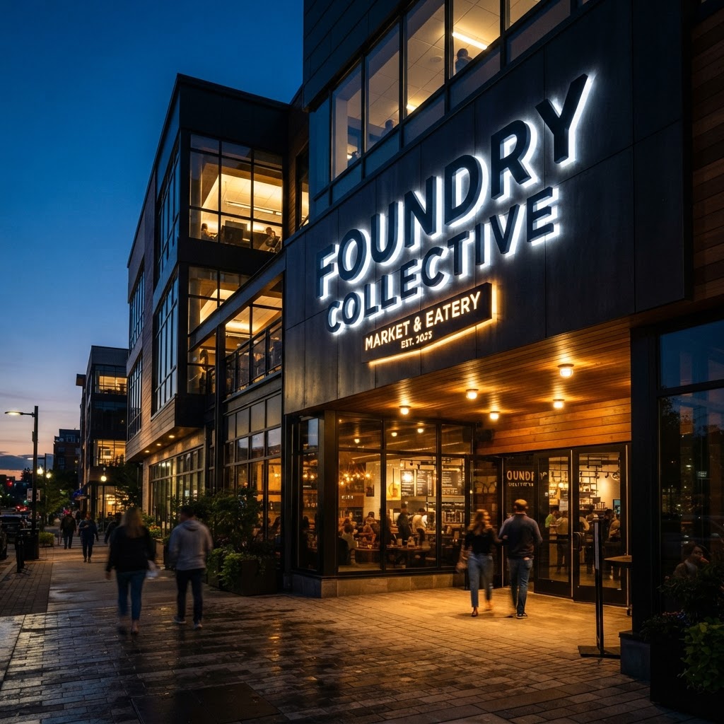
Flat, printed signs blend into the background. Dimensional letters, backlit channel letters, and textured materials create depth, and depth draws the eye. This is rooted in a psychological principle called the isolation effect — our brains are naturally drawn to objects that stand apart from their surroundings. A raised, illuminated sign at night doesn't just look premium; it psychologically separates a business from the flat, static signage of its neighbors.
Consistency Builds Trust
Psychologically, humans associate consistency with reliability. When a business's exterior sign, interior signage, and vehicle graphics all share the same color scheme, typography, and logo treatment, it reinforces brand recognition every time a customer sees it — whether that's on the freeway, in the parking lot, or walking through the front door. This repeated exposure, known as the mere-exposure effect, makes people trust a brand simply because they've seen it consistently presented.
Placement and the Decision-Making Window
Where a sign is placed matters just as much as how it looks. Signage placed at eye level, near decision points (like an entrance or a turn lane), captures attention during the exact window when a customer is deciding whether to stop. This is why professional sign companies map out sightlines, traffic flow, and viewing angles before a single letter goes up.
How Sign Design Applies This Every Day
At Sign Design, every custom sign we create for Orange County and Southern California businesses starts with strategy, not just aesthetics. We consider:
- The psychology of your target customer
- Optimal materials, colors, and lighting for your location
- Legibility from the speeds and distances your customers will actually experience
- Consistency across all your interior signs, exterior signs, vehicle graphics, and banners

Ready to Put Psychology to Work for Your Business?
A sign that simply looks nice isn't enough — it needs to be built with intention. If you're ready to create signage that captures attention and builds trust from the very first glance, request a free consultation with Sign Design today.